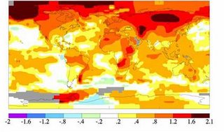
Global Warming Nears 'Dangerous' Level

This color-coded map shows how surface temperatures changed on average from 2001 to 2005. 2005 was the warmest ranked year on record. Dark red indicates the greatest warming and purple indicates the greatest cooling. The numbers refer to temperature anomalies as measured by degrees Celsius.
Researchers say average temperatures are close to a million-year high 1.
1. LiveScience.com


0 Comments:
Post a Comment
<< Home